I've got Eddie Van Halen telling me to jump in both ears, and I can say without a doubt that I have never been more hyped to write an essay about how and why I did an art project. So enough with trying to find a funny title and intro, I am so ready. So. Fucking. Ready.
It's now or never. I ain't gonna live forever (to clarify, Bon Jovi's playing now. My playlist is SO MUCH better than yours).
OK, so for the past couple of years, my friend Oli and I had planned on doing a sci-fi summer project, but that never happens because you're sixteen and you want to breathe after the stupidest exams you've ever done, and then you're seventeen and you want to breathe after the stupidest exams you've ever done, and then you're eighteen, rinse and repeat, and you have festivals to go to, fuck summer projects, you have a Foundation Art & Design year to do that stuff.
And that's exactly what we did - he does the same course at the same place. Convenient.
We heard the idea of a group project being thrown around as an actual possibility, so we took our chance to actually do this thing. My other plan was to continue with my comic and actually publish the first chapter, which in retrospect would never have happened because I got pretty ill, so I'm glad I had this project to motivate me to continue in spite of that - after all, the show must go on, inside my heart is breaking, my makeup may be faking, but my smile still stays on (thanks Freddie, truer words were never said. You're the man).
Initially the plan was to make a short animatic of a sci-fi world, not quite fully animated because that would be a massive amount of time to sink in to something that we knew our audience wouldn't appreciate for a few seconds of film (something more like the Titansgrave intro on Geek & Sundry) so we somehow ended up being inspired by story-telling in video games. Not the narrative as such, but world building, providing a sense of place, character... all the unsaid things that turn a script from a shit sci-fi film to Blade Runner, or a generic fantasy game into Dark Souls:
|
Environmental storytelling.
It's the way that Ridley Scott lingers on shots of people on bicycles riding in groups through the rain of the night city, weaving through posts, Vietnamese conical hats over their face as the Replicants look for the man who made their eyes, completely unnoticed amongst the neon highrise. It's the way that the Hollowed undead rock back and forth, their grasping arms held high, their empty eye sockets reaching wide as they praise the sun in the shadow of a gnarled, dead sapling that twists into a grotesque wasting corpse, whose desire to reach closer to the warmth of the sun manifested a pathetic growth. |
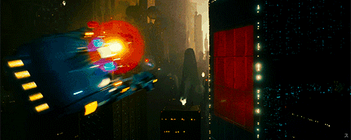
Blade Runner: This one speaks for itself.
Dark Souls 3:
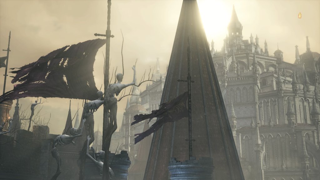
One of the earliest sights of the game, it's a subtle tell that this world is a mythic one, in which sheer will has brought the undead closer to the only warmth they have. |
Blade Runner, Dark Souls, Alien, everything Pixar makes: it's the mark of sophisticated story telling in set design.
So we set about producing a series of early designs for posters, magazine covers, adverts, songs, clothes, toys, commercial nick nacks... parts of the world. And then we realised we were being stupid, because why the hell wouldn't we actually just make a part of the world. We sat down and had a group crit, someone chucked out the idea of making a newsstand, 1920's style - but in the future, obviously, all neon and sci-fi and cool. And yeah, we both thought it was great.
So we set about producing a series of early designs for posters, magazine covers, adverts, songs, clothes, toys, commercial nick nacks... parts of the world. And then we realised we were being stupid, because why the hell wouldn't we actually just make a part of the world. We sat down and had a group crit, someone chucked out the idea of making a newsstand, 1920's style - but in the future, obviously, all neon and sci-fi and cool. And yeah, we both thought it was great.
|
I keep saying 'we' because it's a lot quicker, but with most things we pretty much had the same vision. That's not to say we didn't stop to talk before we did everything, and we certainly compromised on a whole bunch of stuff, but yeah, we drew a lot of concern from the course tutors because they didn't seem to get it, or they thought we were being too ambitious, but we knew what we wanted to do, and we knew we could. It's a fine line between confidence and arrogance, but I guess we've known each other for a few years: Oli motivates me because I'm lazy, and when I am in the zone I more than make up for it by working well into the morning and making a whole bunch of good stuff before burning out and needing a boost of inspiration again. And he's consistent and focused. We make a pretty good team.
That aside, we both signed up for a trip to Berlin with the university, and we set our sights on that as a research opportunity pretty early on. It ended up pretty heavily influencing the tone of our futuristic vignette when we got back. There's something about a very old city with a very oppressive modern history that I think inspires art, or at least that's the case with Berlin. It really feels like a cultural mish mash, and I think that our future is a cyberpunk Berlin. It's certainly grungy enough. Berlin - along with real world events now - influenced the story of our world: METROcorp (a name I chose based on the METRO Group signs I saw in the background of a photo from Berlin) is the most influential corporation among a few, alongside others like Apple or Microsoft which have expanded into political spheres. The CEO of METROcorp, a xenophobic bigot known as Chump (hint hint, nudge nudge) who happens to be an alien is spearheading the construction of a wall to separate the alien suburbs from the human areas, the more liberal half of the city from the other side. The media machine is under the thumb of the corporations, so the language we chose to use on our magazine covers is intentionally more deliberate, and there's not so much honest political media, despite the CEO of METROcorp still getting on the cover of Time magazine. But yeah, it's a realistic world, despite it being sci-fi. Tensions are running high, but it still feels pretty grounded, there probably aren't all that many hovercars or laser beams. The final project is 12 covers |
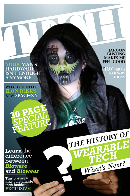
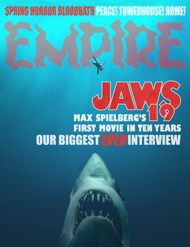
Magazine Covers - We made 12 of these, all slightly different based on the varying size of the real magazines.
|
stuck to magazines that line the front of the stall for people to buy, a series of postcards that hang to one side and a cork board sign to the other. Above, using EL wire, we made a glowing pink and blue sign that alludes to METROcorp, and we decorated the back wall with more designs traditional to the aliens (also made with EL wire) and mirrors which, from a certain angle, reflect a futuristic shotgun hung just below the counter. This is a dangerous world for the person who works in the shop - a child's drawing hanging on the wall shows an alien family and their alien dog, and graffiti covering the stall spells out "Xeno go home".
|
We had quite a few ideas we didn't end up running with that I'd made progress on. One of those was an alien papier-mâché mask for someone to wear, which was going to be covered in liquid latex and airbrushed to get a skin texture and blend into the face to allow the mouth to move. The mask has disappeared, because during the chaos of "organising" the studio for exhibition, someone else managed to throw it away, not that we were using it anyway. The initial plan was to have a TV screen in the corner of the stall playing popular daytime TV - which in this case is a futuristic version of wrestling called BloodSport, and for the first time ever in the human league an alien known as "Xeno the Voidwalker" was competing and making his big entrance. I wrote and recorded an intro theme for him, and a script for the announcers as he enters the arena: the plan was to film it in the dark using a smoke machine (which I'd sourced for this purpose) and carefully placed spotlighting for shadows and highlights, which would obscure my relative inexperience with prosthetics to make the mask look passable. Ultimately, we agreed that if we had time after building the installation then it would be a great finishing touch, but in the end we found we didn't have time to pursue it.
Another idea that popped up towards the end of the project was a suggestion I made to have the shop keeper's radio playing music in the background, which could also establish the sense of the future that we wanted to display, whilst providing an extra layer of interest without distracting as much as the short repeating film on the TV would have done. This way it can also last longer. I edited a 20 minute loop, using sound clips from the Year 3000 by Busted and the Reservoir Dogs OST to make "K Billy's Super Sounds of the 'YEAR 3000!' It just keeps on... truckin'." The music was a compilation of Mongolian Throat Singing, obscure 80's experimental synth-rock, chip-tune folk music, and my own theme that I wrote for Xeno the Indomitable, a |
|
sluggish, intense black metal tune. I then changed the EQ of my track in Audacity to give it that slightly tinny radio sound - not because in the future, audio clarity wouldn't have improved, but because it reads better as 'radio' to the audience, who wouldn't see the radio (especially since there wouldn't be one visible, the plan was to play it on loop from an old iPod connected to a hidden speaker).
One of the other ideas that we got really excited about but then scrapped due to our time constraints was the idea of leaving a dead body in the hallway. So the plan was to potentially build the side wall with a false door that could be removed and flipped to show a broken side with a green blood spatter on it. There'd be a body covered in a freshly bloody sheet lying on the floor, and through the way the sheet clings to the form you'd see that it has four arms, and a large, flat, conical head. "POLICE LINE, DO NOT CROSS" hangs across the hallway, ripped in the middle and hanging so it's not a safety hazard. In theory, we'd bring the body out after everyone has passed through to the rooms that contain everyone else's final projects, because ours is the first that they'd see, they'd glance across it, take it in and move on. And when they go to leave, we grab their focus as they step back out into the corridor and see that things have changed. Then we have their attention. They look at our project in an entirely new way. The issue, however, was that we just didn't have the time and it's something I'm kind of disappointed about because I think if we did it right it could be brilliant.
As part of my research I ended up thinking about using language to make a magazine cover rather than the focus being the image, and I somehow recalled old 1800s Serials, like The Pickwick Papers by Charles Dickens or Great Expectations. Originally, they were released in a weekly serial format, chapter by chapter, and serial storytelling has developed from that point: looking at the state of film franchises and the growth of the new era of TV (with Netflix and Amazon Prime), the serial has developed from soap operas and comics. It would be interesting to see that come full circle in the distant future, so I conceived of two competing magazines, one called "All-New, All-Different SERIAL!" and one called "Flyleaf", which would take very different approaches - Flyleaf would be formal, black and white with dingbats for decoration and small text to save on space (a logo in the top left corner of both magazines would be the symbol of the "Paper Conservation Tax" which would be reminiscent style wise of the Comics Code Authority logo), and SERIAL would be flashy and colourful, but also with minimal use of images - its language would be more obvious, but still as concise as possible, with the story starting on the front page.
So I guess in conclusion, we did a lot of stuff that I think was really successful, my playlist has been motivating me to write all of this, and I don't have something witty to say to end this. I'm sure I've missed things, but everything is evident in the final piece itself if you're insightful enough.
It occurs to me, I need to get a nice short film of the installation.
Pics or it didn't happen.
 RSS Feed
